Choosing the Right Palette for Your Logo
A brief text addressing the role of colors in brands and logos.
Francisco Rehder
2/25/20243 min read

When it comes to creating a brand, choosing colors is one of the most important decisions you'll face. Colors have the power to evoke emotions, convey messages, and establish a unique identity for your brand. Therefore, understanding the meaning behind each color is essential to ensure that your logo effectively communicates the desired message.
Each color carries a series of associations and cultural meanings, and it's important to consider how these perceptions can influence brand perception. For example, red is often associated with energy, passion, and dynamism, making it a popular choice for brands wanting to convey a message of power and excitement. On the other hand, blue is often seen as a symbol of trust, security, and seriousness, being a common choice for companies aiming to convey credibility and professionalism.
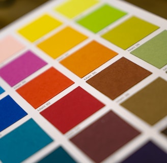
It's important to note that color perception can vary according to cultural and individual contexts, so it's essential to consider the brand's target audience when choosing the logo color palette. A solid understanding of color psychology and careful analysis of the message the brand wants to convey are essential for creating a cohesive and impactful visual identity. Below is a guide on the use of colors in brand logos and insights into their meaning.
Red: Red is a vibrant and powerful color, associated with passion, energy, and urgency. Brands like Coca-Cola and Netflix use red to convey dynamism and excitement.
Blue: Blue evokes trust, calmness, and professionalism. Companies like Facebook and American Express choose blue to convey security and credibility.
Yellow: Yellow suggests optimism, joy, and creativity. Brands like McDonald's and Mercado Livre use yellow to create a warm and inviting atmosphere.
Green: Green is associated with nature, growth, and health. Companies like Starbucks and Greenpeace use green to communicate sustainability and freshness. Also very common in names of Hospitals and Health related centers.
Orange: Orange is an energetic and friendly color, often associated with innovation, creativity, and vitality. Brands like Nickelodeon, Itaú, and Fanta use orange to create a fun and vibrant atmosphere.
Purple: Purple conveys sophistication; it's the color of royalty and adds a touch of elegance and prestige. Brands like Cadbury and Nubank choose purple to create an image of originality.
Pink: Pink is often associated with femininity, delicacy, and romance. Companies like Barbie and Victoria's Secret use pink to attract a female audience and convey a sense of glamour.
Black: Black suggests elegance, sophistication, and authority. Brands like Chanel, Louis Vuitton, and Nike use black to create an image of luxury and exclusivity.
White: White is associated with purity, simplicity, and modernity. Companies like Apple and Adidas opt for white to convey clean and minimalist design.
Brown: Brown is an earthy color that evokes stability, security, and reliability. Brands like Hershey's and UPS use brown to convey a sense of tradition and reliability.
Logos strategically use colors to influence consumer behavior in various ways:
Attraction and Recognition: Vibrant and distinct colors can attract the consumer's attention amidst a variety of options. Additionally, a unique color can make a brand more easily recognizable among competitors.
Emotional Connection: Colors can evoke emotions and create an emotional connection with consumers. For example, a brand that uses shades of blue can convey a sense of trust and security, thus building a relationship of trust with the audience. See how Itaú carefully applies the color orange in its communication; or Banco do Brasil with shades of blue and yellow.
Purchase Behavior: Studies have shown that colors can influence consumer purchasing behavior. For example, red has been associated with an increase in the sense of urgency, leading consumers to act more quickly. Similarly, green can be used to convey a message of sustainability, attracting consumers concerned with environmental issues. In general, retail always uses primary colors: Yellow and Red boost actions, convey confidence, and intensify thoughts. It's ideal for unmissable promotions, stock clearances, and any action aimed at encouraging the customer to buy at that moment.
Quality Perception: Colors can also affect the perception of the quality of a product or service. Dark and sober colors, like black, can be associated with luxury and high quality, while bright and vibrant colors may suggest a more accessible product.
In summary, when choosing colors for your logo, always consider your target audience, the message you want to convey, and your brand's personality. Try different color combinations and don't be afraid to be creative.
Remember that the use of colors can have a significant impact on the perception of your brand, so choose wisely and based on a solid understanding of the meaning behind each color.